
Alignment rects in Auto Layout views
In the UIView documentation, Apple describes alignment rects:
The constraint-based layout system uses alignment rectangles to align views, rather than their frame. This allows custom views to be aligned based on the location of their content while still having a frame that encompasses any ornamentation they need to draw around their content, such as shadows or reflections.
At first glance, this feature feels unnecessary: views can draw outside their bounds seemingly without performance issues1. However, the differentiation between frame and alignment is a powerful, and easily overlooked, feature in Auto Layout.
Automatic with constraints
Views that use Auto Layout for positioning and sizing get alignment rect support for free via alignmentRectInsets. Unfortunately, going by the documentation, this is not evident2.
Let’s work through this using an example. The vertical line is going down the exact center of the container:
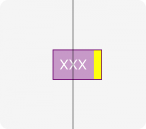
This view has a label and decorative yellow box to the side. Notice that we’re centering relative to the label, and not to the decorative box. This is accomplished with a very small amount of code:
override var alignmentRectInsets: UIEdgeInsets {
  return UIEdgeInsets(top: 0, left: 0, bottom: 0, right: 10)
}
The constraints within the view can completely ignore this fact. With the insets set, the layoutMarginGuide and direct leading, trailing, etc., anchors are automatically inset. This is also true for constraints created via NSLayoutConstraint.
The entirety of the positioning for the view above looks like this:
label.translatesAutoresizingMaskIntoConstraints = false
NSLayoutConstraint.activate([
  label.leadingAnchor.constraint(equalTo: layoutMarginsGuide.leadingAnchor),
  label.trailingAnchor.constraint(equalTo: layoutMarginsGuide.trailingAnchor),
  label.topAnchor.constraint(equalTo: layoutMarginsGuide.topAnchor),
  label.bottomAnchor.constraint(equalTo: layoutMarginsGuide.bottomAnchor)
])

// alignmentRectInsets doesn't support RTL,
// so use left/right rather than leading/trailing
yellowBox.translatesAutoresizingMaskIntoConstraints = false
NSLayoutConstraint.activate([
  yellowBox.topAnchor.constraint(equalTo: topAnchor),
  yellowBox.bottomAnchor.constraint(equalTo: bottomAnchor),
  yellowBox.leftAnchor.constraint(equalTo: rightAnchor),
  yellowBox.widthAnchor.constraint(equalToConstant: alignmentRectInsets.right)
])
We can now apply whole-view effects, like the border in the example above, without having to create elaborate view hierarchies. The decoration is part of the view, not floating outside of it.
The only downside here is that alignmentRectInsets does not use the new NSDirectionalEdgeInsets introduced in iOS 11, so right-to-left support may need to look at effectiveUserInterfaceLayoutDirection.
Tappability
Apple recommends 44pt tappable areas for controls which are often designed to be aligned with other elements on the screen, often times closer than this tappable region.
To combat this problem, a common solution is overriding hitTest(_:with:) on the button to allowing it to tapped outside of its frame. This makes it hard to visualize where a screen is tappable when debugging the view.
Let’s solve this problem using alignment rects. A custom UIControl subclass can use the regular insets like the view example above. Unfortunately, UIButton does not use Auto Layout internally, so a small subclass is needed to handle the insets:
class IncreasedTappableButton: UIButton {
  // one potential optimization is to calculate insets that would
  // make the button >= 44.0 pt tall/wide
  override var alignmentRectInsets: UIEdgeInsets {
    return UIEdgeInsets(top: 10, left: 10, bottom: 10, right: 10)
  }

  override var intrinsicContentSize: CGSize {
    var size = super.intrinsicContentSize
    size.width += alignmentRectInsets.left + alignmentRectInsets.right
    size.height += alignmentRectInsets.top + alignmentRectInsets.bottom
    return size
  }

  private var boundsInsetByAlignmentRect: CGRect {
    return UIEdgeInsetsInsetRect(bounds, alignmentRectInsets)
  }

  override func backgroundRect(forBounds bounds: CGRect) -> CGRect {
    return super.backgroundRect(forBounds: boundsInsetByAlignmentRect)
  }

  override func imageRect(forContentRect contentRect: CGRect) -> CGRect {
    return super.imageRect(forContentRect: boundsInsetByAlignmentRect)
  }

  override func titleRect(forContentRect contentRect: CGRect) -> CGRect {
    return super.titleRect(forContentRect: boundsInsetByAlignmentRect)
  }
}
This gives us a button where the frame is slightly bigger, but things are positioned relative to the original size:

It is worth pointing out that this will not work inside a UIStackView since the larger frame will extend outside the bounds of its container and UIStackView is fairly aggressive about ignoring outside touches.
If outside views are opaque and do not cause blending or offscreen rendering, it does not appear there are any additional costs to having subviews drawing outside bounds.
-
I’ve spent hours searching for documentation about the performance impact of drawing outside bounds, and there’s not a lot of detail available. ↩︎
-
Often in Apple SDKs, the headers contain information the documentation is missing. This is from the UIView headers:
Constraints do not actually relate the frames of the views, rather they relate the “alignment rects” of views. This is the same as the frame unless overridden by a subclass of UIView.
I did not notice this and I am sure many others are missing this key piece of documentation. ↩︎